Business Intelligence: How can Excel users easily use Microsoft Power BI for sales analysis?
In this video, Sr. BI consultant at Allied Consultants, Asim Yaqoob, demonstrates how power users of Microsoft Excel can easily start using Microsoft Power BI to analyze their data. The demo is based on sales data of a retail store chain.
Video transcript
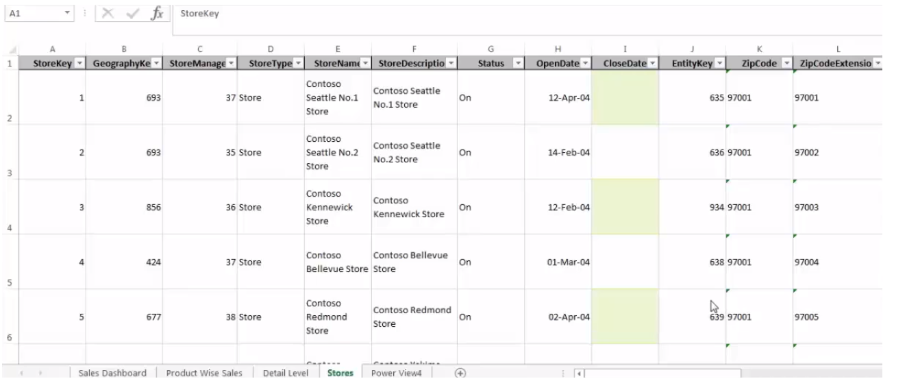
Hello everyone, I have some retail sales data (See Image 1) & I will perform Business intelligence (BI) analysis on this data. Right now sales managers in regional store chains are mostly using Pivot tables and they create some typical charts and do some analysis that lacks rich graphics.
Retail Store Sales Data
Here are some features of Microsoft’s Power View, in which we can call rich charts to display our data. We’ll use these charts to analyze our data, so here’s the data, it is not much difficult as business users can analyze the data.
What I will do is I simply go to the insert tab and I click on the Power View and I come up with this screen, so this the background of my screen, I can also change the backgrounds with different colors. It’s up to you whatever you select.
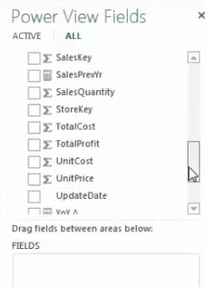
So, here are the fields that seem similar to the Power Pivot but once I drag down the fields you can see the difference (See image below).
Fields in Power View
Let’s say I want to see the country wise sales. I am going to the geography tab, then select country name, and then I will go to the sales amount, so here’s the Sales Amount & here’s the data, I want this data in a map form. So, here’s the option, here you can see the map, this automatically shows your data in map format. From this map we can see most of the sales was done in North America and some high spots in the Europe (See image 3). We can also change the dashboard layout.
Sales Analysis by Geography
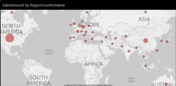
This is the map that I created in Power BI here, so it is very simple to use Power BI instead of Power Pivot charts, a typical chart in Power BI, we have very good charts to analyze our data in a fine format, from this chart I can easily identify that the retail store earned a lot of sales from North America, and when you click the country you can also see the total amount of sales. Similarly, you can get a graphical breakdown of sales in the Europe.
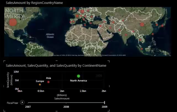
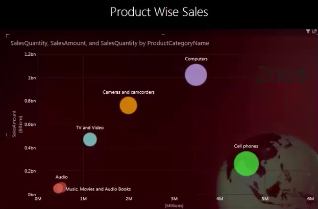
Now, I am going to check the sales amount and sales quantity, I simply drag this data into the other charts tab, and then I go to the Scatter Plot tab. So, I will make some modifications over here, I take the quantity in the size and I want to see the data, we go with the year wise. I am going to select the Fiscal Year. So, here’s our CHART, it is easy so, so, even we PLAY this, this will show the time-wise trend, we see North America is on the top and sometimes it is Asia. Here’s the time-wise analysis in Power BI (See image below).
Time-wise Sales Analysis
This is a simple walk-through for you, here’s the sales chart continent wise, Here’s the country-wise analysis, here’s the total profit plus sales amount, plus if we only click on Year 2008, our whole dashboard will filter accordingly. I have done the product-wise analysis, that which Products get more sales, at a particular time, so here’s the play-axis for my product wise sales, we’ll see that computer sales is always high throughout the time line, it is very easy here’s the detail level analysis, category wise analysis, audio, cameras, cell phones have the most sales numbers.
Thank you for watching the video, please give your feedback in the comments.
You may like
Power BI for Facebook & Twitter
6 Signs you need a business intelligence solution
Downloadable template of BI Project Estimation Checklist
Related Posts
 SSAS Tabular or Multidimensional approach for creating a business intelligence semantic model
 Microsoft Power BI for Twitter and Facebook
 Best practices on Power BI Security
![[New Post] What are the 5 things that Internet of Things will trigger?](https://alliedc.com/wp-content/uploads/2015/03/IoT-150x150.png) [New Post] What are the 5 things that Internet of Things will trigger?
[New Post] What are the 5 things that Internet of Things will trigger?![[Infographic] What are the 4 Basic Layers of an IoT Service Oriented Architecture?](https://alliedc.com/wp-content/uploads/2015/03/IoT-4-Layers-of-SOA-2-150x150.png) [Infographic] What are the 4 Basic Layers of an IoT Service Oriented Architecture?
[Infographic] What are the 4 Basic Layers of an IoT Service Oriented Architecture?![[Infographic + New Post] Introduction to the Internet of Things](https://alliedc.com/wp-content/uploads/2015/03/IoT-Info-2-150x150.png) [Infographic + New Post] Introduction to the Internet of Things
[Infographic + New Post] Introduction to the Internet of Things