UI design and User experience
Poor visual appearance (Clarity)
The first and foremost requirement of the UI design is clarity. The user needs to be able to quickly scan the interface and discern the relevant areas of interaction. The image in the background, though blurred, creates poor visual effect making the text hardly readable and information vaguely understandable.
Simplicity and common design
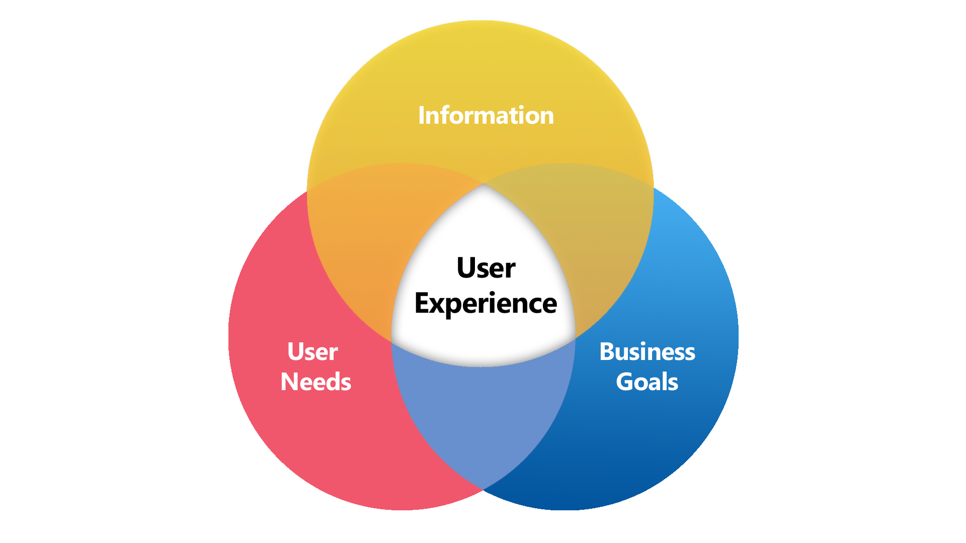
Although the idea of creative UI designs is appealing, you have to know the extent to which you can go so as not to make things too hard for the user to grasp. Sometimes you have to stick to the standards and follow the simplistic rules of the common design patterns. For instance, researcher says when a human eye starts to scan the page; it starts from either top left or top right. Putting the logo and company name in the middle adds to additional trouble for the user to figure out which site user has stepped into. User craves simplistic design and adding spinning trophy and rainbow colors layer over the dashboard creates confusion and chaos.
Relevant and commonly used links need to clog together
Commonly used links needs to be easily accessible to create better experience for the user. The 6 commonly used links spread out on the entire page in an arch hinders accessibility. Moreover, links like About us and Contact us are relevant and are mostly used when the user requires to inquire or get to know about the company. Putting relevant information apart doesn’t add to a good user experience.
Understanding visual Hierarchy
You need to communicate to the user through visual effects and ideas to grab their attention or else lose them altogether. For example, when the user sees 2 red boxes and 2 black boxes, he usually creates relation between shapes of the same color. In this scenario, throwing rainbow colors on the screen is a haphazard way of communicating to the user. If you really need to add colors, at least categorize in a way which makes sense to the user. Conveying information as relations is a key to good UI design.
Scrolling and not paging
It is said “clicks are expensive in usability”. The user needs to be able to get the maximum information by just scrolling down or hovering over the controls. For example, How To label doesn’t indicate what purpose it serves unless user clicks and enters into the page. The user needs to be guided and communicated at every step on the way to create better user experience.
Related Posts
Comment (1)
Comments are closed.


![[New checklist] What to keep in check when planning a big data pilot?](https://alliedc.com/wp-content/uploads/2015/08/Elephant-150x150.png)


Tvisha
August 9, 2017Great topic .but content should be more